Wednesday 30 December 2015

Personal Work; Character Production Art (6)

The 5th spot on the team goes to the new comer who recently joined the Wielders, It's Scarlett Bei (No her name is not spelt incorrectly this is how its written for her).

Like I stated, Scarlett is the new comer to join the Dratford Militia and to be part of the main team in the Wielders guild. The power she Wields is Electricity and she is able to conduct that power through the staff she uses for battles.
Since she is new she hasn't really been given an Armour set and is quite frankly thrown into this whole system and is expected to give results.


The color design in the first model was mostly inspired some pallets used on Blake Belladonna from RWBY, but I wanted to give her a more natural look to her since she is the new girl, so she has little equipment, which is where the leather padded jacket and skirt came from as well as the boots.
The same goes with the last model, just given her a more natural look.

The reason why she has one red eye with a deformed pupil is due to her being unable to control her 2nd soul. So it's basically two souls trying to gain control of one body, she lost control once and that nearly caused the destruction of the city. Damage wise, think Avengers, That's how deadly and destructive these souls can be.

Designs are subject to change.

Tuesday 29 December 2015

Personal Work; Character Production Art (5)

The 4th Character of the 7 happens to be a Water Wielding Assassin by the name of Kaira Sapphire.

Kaira is a roguish type character and attacks mostly when the enemy doesn't expect it, to which is why she has the blade she has, so she can attack from the shadows to either stab or to drown her enemy.
Since she manipulates water she has to carry around a flask of sorts filled with water in case she is in places where there is not much water to use.


The design of Kaira is mostly based from the Assassins Creed and Star Wars the Old Republic in appearance with both hood and technological wise.
She mainly keeps to herself and is occasionally shy but she is a tidal wave when in a fight.

This design is subject to change.

Personal Work; Character Production Art (4)

Number 3 of my main 7 Characters, this time round it's the Ice Wielder Kiyan Qwindu.

Now Kiyan has been in the making for years, and I mean years, he was originally going to be the main protagonist instead or Ray Frost (1), but the story and his personal background and personality didn't quite fit with the role so he was bumped down to 3rd place.


The overall appearance of Kiyan is basically based on myself but his personality and style are completely different to my own.

This piece is subject to change so this might not be final, who knows.

Monday 28 December 2015

The Shining, 1980, Review.

Fig 1 - The Shining Poster

The Shining is a 1980's Drama, Horror movie Directed by Stanley Kubrick and based on the selling novel with the same title written by Stephen King.

The story centers around a man who takes his wife and son to stay at a lodge during the winter through summer since he took the role of janitor even knowing the stories of what happened with the previous janitor and the murders that took place there. While staying at the lodge strange hallucinogenic events start to happen throughout the hotel but it seems to only affects Jack Torrance (Jack Nicholson) and his son Danny Torrance (Danny Lloyd), whereas Danny is portrayed as the protagonist and further along the story jack slowly turns into the antagonist which was pretty well done showing Jack slowly being turned into the murdering psychopath to which seemed to be the role Jack Nicholson was made for, he played the role superbly well.

When you read the word horror in the description of this movie you would imagine to see all the cheesy horror cliches that you would see in any horror movie of that time and even now you still see bits of that coming through to today's horror movies. Although this movie does have it's fair share of cliches but are rarely shown, it plays out completely different from other horror movies during the time it came out which is pretty rare. Other movies have the same layout in both design and story, the design has to be Gothic or disturbing to unnerve the audience and the characters have to be unoriginal and be the typical screaming women in distress and the dumb typical men who think they can handle any spooks that come there way. Some scenes may or may not be as effective to scare you but more to disturb you. To quote reviewers in this regards;

'The Shining is like a near-miss auto accident: You don't know how scared you really were until you start shaking a few hours later'. - Ralph Novak, Peoples Magazine.

'The result may not quite match Kubrick's greatest films, but it is enthralling and hypnotic - a brilliant, ambitious attempt to shoot a horror film without the Gothic trappings'. - Steve Biodrowski, ESplatter.


Fig 2&3 - Jack Nicholson performance as the murdering dad   

 The set layout for the lodge is both massive and mesmerizing in both layout and design. When you look at the Lodge from the outside it looks pretty huge but only when you get inside, although you only see a few corridors and rooms, it gives the sense of enlargement that if you round this corner you'll find an open room or several rooms or even a huge stairway that leads to the unknowns of upper and lower floors, it just makes you want to ditch the movie and spend the 1.40 min just exploring the place. the artistic value of the lodge is specifically symmetrical in its patterns which also spans to the maze outside the lodge, to which by the way had a really cool transition from the model to the actual thing from a top down perspective.

Fig 4&5 - The transition between model replica and the actual Maze.

Fig 6 - The Overlook Hotel Exterior.
Fig 7 - Main Hall
Fig 8 - Reception
Fig 9; The Bar & Hall
The Characters are come and go, There are some who play the role exceptionally well and others that are quite frankly making you wonder why they are there. The character of Danny is quite an interesting character but it feels as if they completely gone over his role in the movie. At the start they make him to be a specially gifted boy that is never really clarified on apart from it being called The Shining and that he can mentally commune with other people with the same ability, but that's roughly it, it kind of feels like a wasted opportunity to fully explore what he can do and how far it can go.
The development of the character Jack was done as good as it can be, at the start of the movie he is a hard working man who wishes for a relaxing time to write as he looks after the hotel, then it slowly shows him start to get manipulated and turned by the hotel and its untold secrets that by the end even left the audience scratching their heads, well it wouldn't be a Kubrick film if there wasn't a head turner at the end.
The Character of Wendy Torrance (Shelley Duvall) can be interpreted in two different ways. One way she could be portrayed as a caring mother and wife who only cares for the safety of her son, the other way is that she could be portrayed as a women who interferes to much in things that don't concern her and screams too much, either way you have to applaud her tenacity and eagerness to get the movie done with everything Kubrick was throwing at the character to fully get her in the role and situation the character was in.

Image Bibliography:

Fig 1;
http://orig09.deviantart.net/bb85/f/2011/336/3/a/the_shining_poster_by_rustycharles-d4hzyor.png

Fig 2;
http://the-indie-pendent.com/wp-content/uploads/2015/06/theshining-1.jpg

Fig 3;
http://media.ifccenter.com/images/films/the-shining_592x299.jpg

Fig 4;
https://i.ytimg.com/vi/Ley9k94GoZU/hqdefault.jpg

Fig 5;
http://41.media.tumblr.com/2213b7ac394683e7648ac5d4991d1e7f/tumblr_nhudt6pTQc1qzfsnio4_1280.jpg

Fig 6;
http://vignette1.wikia.nocookie.net/stephenking/images/a/a7/The_Overlook_Hotel.jpg/revision/latest?cb=20131105045429

Fig 7;
https://i.ytimg.com/vi/WQjj6RZK7I4/hqdefault.jpg

Fig 8;
https://media.licdn.com/mpr/mpr/shrinknp_800_800/AAEAAQAAAAAAAAUCAAAAJGVkZTYxNWNkLTM4MDAtNDlkYS1hNGJkLTk5MTM2M2FhYmM4MA.jpg

Fig 9;
http://s50.podbean.com/pb/f26c88fc4d4a6f99325ff705bec0374d/568184f6/data2/blogs1/23652/uploads/shining10.jpg

Bibliography:

Ralph Novak, Peoples Magazine.
http://www.people.com/people/archive/article/0,,20076829,00.html

Steve Biodrowski, ESplatter.
http://cinefantastiqueonline.com/2009/02/the-shining-1980-horror-film-dvd-review/

Thursday 24 December 2015

Personal Work; Character Production Art (3)

The 3rd installment of my many characters, this time round it is the female archer Jennifer Strive (or Jen for short). Trained under her master and fellow apprentice, she has learnt the many arts of blade fighting and her archer skills could be compared to Hawkeye from Avengers. Probably due to the fact that she can manipulate objects with her mind through Telekinesis so her shots always hit their mark.

Her weapon is a handy down from her master, A bow that comes apart to form two blades thanks to the mechanics within. The string is not there but replaced by a laser string that shuts off when the bow is transforming into it's other form.


The face didn't come out that well in my opinion with the eyes, but other than that I'm really pleased with how this came out concept wise.
Her first outfit was inspired by the Boss's outfit from MGS 3 with a few modifications to make it stand out from hers.
Her last outfit was inspired by Hawkeyes outfit from the Marvel Cinematic Universe (Not the comics).

Of course all of these are probably going to change, but now they look good how they are.

Sunday 20 December 2015

Personal Work; Character Production Art (2)

The second installment of my ongoing character Arts, this time round it is the Main Protagonist named Ray Frost, Leader of a team of 7 members including himself.
Ray wields a one handed sword but could still be handled by two hands which is infused with the power he wields which is Infa manipulation (Manipulating and Extracting the powers of the Infa-world/Spiritual world).

Ray Frost
The first model shows his normal attire which will be the main clothes for him.
The second model shows him beaten and injured but unleashing his second soul which allows him to becoming a lot more stronger, kinda like a boost. But it causes the second soul to take over his body for a period of time.
The third model will probably be a new attire someday if I decide to change things up a bit, but will see where it goes first.

I will probably write up a synopsis of the overall world and lore of the characters and world, but probably not on here.

These characters aren't something that I came up with in a short time, I have had these characters and world and stories in mind for a few years now and have been slowly developing them through time, I'm just showing them here to see what you guys think and give feedback on that thought.

Tuesday 15 December 2015

Personal Work; Character Production Art

Thought I would give one of my many Villains a new makeover look since I wasn't happy with the old look, and I'am really surprised at how well this came out (Considering it is Production Art).

Might be doing more of my characters in this style through the holiday, not sure yet depends on the day.


The first two are Armour that 'it' uses when 'it' is a villain and the last one is the Armour 'it' wears during redemption and fighting with the heroes.

Feed Back is greatly appreciated in these posts and will help me with future production style art.

Wednesday 9 December 2015

@Phil, @Simon What If Metropolis; What Looks Better?

Just wondering what would look better, Window Frames or No window Frames?

Window Frames

Windowless Frames

Tuesday 8 December 2015

What If Metropolis; Matte Painting.

The Matte Painting for the Set, not that bothered with the lower section of the piece cause the models will obscure most of the lower sections, the main thing that will be noticeable is the upper section of the piece with the sky and planet.

Problem is when I add the Matte Painting in, the whole image looks dark and doesn't stand out.
So if anyone has any suggestions on how to lighten it a bit without creating lights i'm all ears.


Sunday 6 December 2015

What If Metropolis; Texturing, Which is better?

Which window frames would be better for this scene?

Small Frames. Big Frames. Or No Frames.

If yes to frames, I'll refine the diagonal lines to look less pixelated.


Choice NO. 1

Choice NO. 2

Choice NO.3

Saturday 5 December 2015

What If Metropolis; Lighting set up Run Through.

A set up of the lighting for the scene.

Final Image potential set up, unless something better comes along.


Friday 4 December 2015

Flash Tutorials Character Animation PT2. 1/2

Will finish and refine this later.

What If Metroplois; Set Lighitng

Had a few problems with the lighting aspect but nothing that can't be fixed.

I like the blue aspect of the lighting because I feel it will give the buildings a sort of darker feel along with the building colors.

Lighting.

Thursday 3 December 2015

Suspiria, 1977, Review.

Fig 1, Suspiria, 1977 Poster
Suspiria, Directed by Dario Argento and released in 1977 is an Italian Horror, Mystery movie that has more horror than mystery. Just like all horror movies with gore, violence, and insane killers, this movie doesn't disappoint on that aspect but is completely disappointing story wise. There is no mystery and no real story and no character development what so ever in this film. This movie is basically to see who can out beat each other with the most gruesome deaths.

The movie follows protagonist Suzy Bannion (Jessica Harper) an american dancer who moves to Freiburg to join a Ballet school only to find out the morning upon her arrival a fellow ex student was murdered along with a friend. This leads to several other murders all done in unique ways, also the soundtrack for the movie is really immersive and impressive, that it really pulls you in along with the camera moments it really makes it a memorable moment, although the music does not keep you surprised, from when you hear it once you get surprised and a sudden shock but once you hear it again you can kind of tell when the murder is going to happen plus the song is a definite sign of an impending death, so you can tell it's coming.

The set designs for the movie are really biased color pallet wise. The only colors we see are different shades of red and hints of blues when ever their is suspense or when a character is put in a situation that could be life threatening. The only times when you see anything relating to the normal world is during the day or the scene where Suzy goes to meet Dr Frank Mandel (Udo Kier) about her friend Sara (Stepahni Casini).
Perhaps the reason why Argento chose these colors and set designs is to, quote one source, to distract the audiences attention so they won't notice the bad story telling.
'Argento's skilful use of unsettling, intense colour and stunning set designs adequately obscure the film's numerous structural flaws.' - Film 4.
The set design are interesting but unfortunately not enough to distract from the story and several effects.

Fig 2

Fig 3

Fig 4
Fig 5
Fig 6
Fig 2-6 many shots of the lighting and colors used in the movie. The colors give a, not enchanting more of a unearthly look, you have this girl who has flown from everything she knows to a new land so she is going to feel isolated, so these colors show that especially the moment at the start of the movie with the automatic doors at the airport they played the creepy electric rock music only when the doors were open, so again giving the sense of alienation. So you do have to give props to Argento on making the character feel isolated and alone.

Fig 7
Fig 8
Fig 7-8 the only times in the movie where it seems like normal place.


Image Bibliography:

Fig 1;
http://img08.deviantart.net/7398/i/2011/288/5/9/suspiria_film_poster_by_lorado69-d4cxfgu.jpg

Fig 2;
http://3.bp.blogspot.com/-w4jiuRwnKzY/TzqJ1blYY9I/AAAAAAAAAII/suJWsjTFz-8/s1600/Picture+17.png

Fig 3;
http://2.bp.blogspot.com/_0AarlGPFaZQ/S-Zp-4zmWRI/AAAAAAAABRk/cBGnVKWV3S4/s1600/PianoMedio34_1h18m23s.png

Fig 4;
http://1.bp.blogspot.com/-qnvsekYF7X8/U1jAC-wxTgI/AAAAAAAAU4Y/ElYY4pO4hNE/s1600/suspiria03.png

Fig 5;
http://www.popoptiq.com/wp-content/uploads/2012/10/suspiria6.jpg

Fig 6;
http://www.webalice.it/antoniobigliardi/suspiria93.jpg

Fig 7;
http://www.jaredmobarak.com/wp-content/filmstills/suspiria01.jpg

Fig 8;
http://4.bp.blogspot.com/-3HuRi6sxXx8/VVn_vW-79fI/AAAAAAAAMmU/-QClOSI287U/s1600/BMWTowersAndMuseum1__Suspiria.jpg

Bibliography:

Film 4, October 19 2008;
http://www.film4.com/reviews/1976/suspiria

2001 A Space Odyssey, 1968. Review

Fig 1, 2001: a Space Odyssey Poster.
2001: a space odyssey, Directed by Stanley Kubrick and released in 1968, is a visually and musically impressive movie for its time, something that wouldn't seem possible in making, but was successful.
The movie is separated into 3 acts, although people will complain about the length of the movie but should be grateful for the breaks it gives you before the next act.

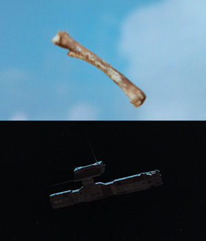
The story starts of with (for its time) one of the best jump cuts in the film industry, with several shots of ape men back in the times before man to jump to a shot of a presumably falling shuttle in space with just one flip of a bone club that was just used by said ape man (Fig 2).
The music that was used during this sequence as well, made it seem very intense and dramatic, as if to make it serve some sort of purpose to the movie (which there isn't), although the music used to show the appearances of the Monolith through the movie was very suspenseful and mysterious as if to say 'this is an important object of some kind and we have no idea what it is, what it does so we have to be cautious' (Fig 3 & 4).

Fig 2, Simple jump cut from bone to ship that
was considered the best for its time.
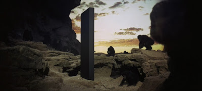
Fig 3, The Ape men discovering and becoming curious
of the Monolith.
Fig 4, 4.000.000 Years into the future, Humans
rediscover the Monolith on the moon.
The Visual quality of the movie starts with the scenes after the jump cut transition with the spaceship and space station with a well known song playing at the same time making it seem entrancing and magical from the way the song was played (Fig 5).
The environment for the station and ships are both spacious and symmetrical in design and a set color code of red and white which gave a futuristic unearthly feel to the interiors, something that was man made but doesn't belong in areas of Earth, which makes you wonder what the set designers and directors thought 2001 looked like from 1968 (not too far off). Even though the spaceships are probably models, Kubrick makes them look like a scene made with CG to quote one reviewer;

'Kubrick's spaceships are perhaps little more than Airfix models, but he makes them majestic, even awesome in the proper sense of the word.' Kate Muir - Times UK.
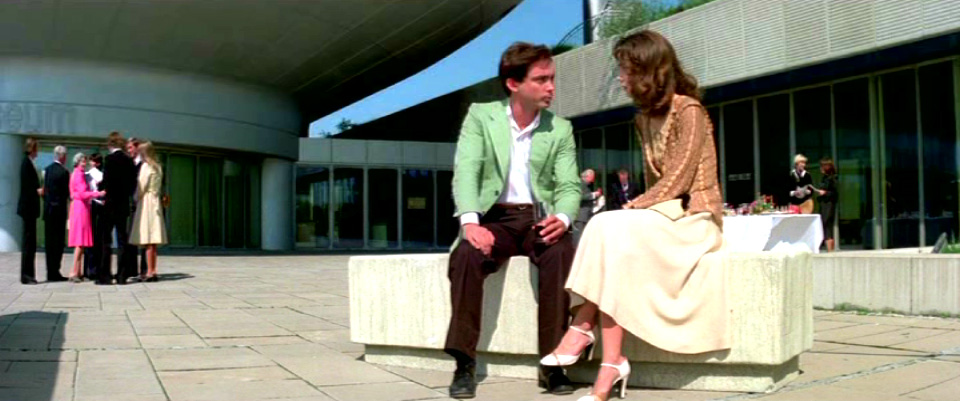
As far as the story goes from there, it really feels as if it just started another movie not really giving the indication of what the previous scenes were saying, just that they dropped that story all together only to bring it up towards the end of the movie only to show it as a round up of what we already know, so the story is not really there, it's as if the movie was only made to be a art piece for both visual and musical traits.

The scenes that star Dave (Keir Dullea) and co pilot Frank (Gary Lockwood) and there fight for survival against HAL (Douglas Rein) are probably the most we see of interior spaces design wise, cause your not just centered around one part of the ship but you visit multiple locations and revisit areas as well, although some of the areas you see do look the same in comparison but sets like;
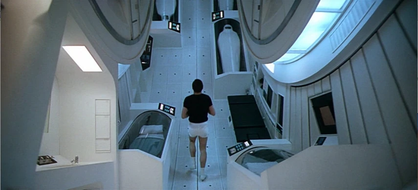
The main hub area with it's take on how gravity works by having one of the two pilots run around the whole room as if on a hamster wheel with instruments and computers along the wall to show that wherever he runs, the area around him will always be level with him which is a pretty good take on how a circular room on a spaceship would be (Fig 6).
HALs computer server room really gives you a sense of an artificial design with reds and blacks with each part of the room being a computer server (Fig 7), this must of given some impact in today media where this color code of room design has been used multiple times through sci fi movies and games.

Fig 5, Spaceship and space station look as if
there dancing along with the song that is played
Fig 6, Showing how the set will be level with the
person (Set was actual made on a hamster like wheel)
Fig 7, Hals server room has given to new set designs
in today media in movies and games. 
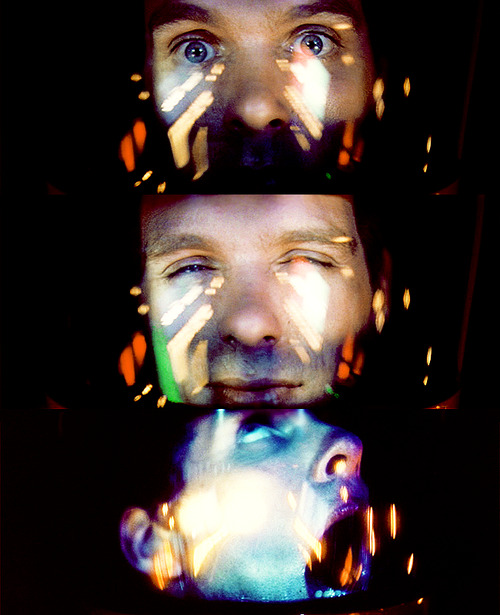
Now, the third act is probably where the editing team and director didn't care anymore for the story at this point or it was just one of Stanley Kubrick iconic mind messing ending. The visuals that was shown was for some an eye sore and others hypnotic, considering the time this movie was made which was the late 60's the years of the hippie era it's understandable but as to why it was put in the movie, probably to show what hyper space or time travel looks like but other than those theories it was completely unnecessary. (Fig 8)
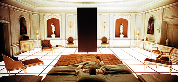
Going past that to the scenes that leaves everyone scratching their heads is both confusing but also intriguing with it leaving many questions. Where is this place? Why is Dave there? Whats with the constant ageing and isolation that he has to suffer for? What part does the Monolith have in all of this? There have been many answers to this questions but none have been proven. perhaps some where down the line, from this movies debut, that Kubrick has answered this question but just like all reviewers nobody knows if it is the truth. (Fig 9) This can probably be best summed up with quotes from two other reviewers;

'Extraordinary film making, creating intellectual arguments mostly through image and music.' Tim Brayton - Antagony and Ecstasy.

'Notoriously baffling yet oddly compelling...' David Nusair - Reel Film Reviews.
Fig 8, Hyperspace or Time travel?
What ever it is seems painful.
Fig 9, A short passage of time for us is a life time
for Dave as he sees the Monolith in his final minutes.

Image Bibliography.
Fig 1;
http://vignette1.wikia.nocookie.net/2001/images/d/d7/And_you_know_it.jpg/revision/latest?cb=20111221194656

Fig 2;
https://upload.wikimedia.org/wikipedia/en/4/45/MatchCut.JPG

Fig 3;
https://barrykibrick.files.wordpress.com/2015/07/2001space037.jpg

Fig 4;
http://images.sequart.org/images/2001-moon.jpg

Fig 5;
http://api.ning.com/files/J-KLMV9NLF9a1kq29Ia4Blc0jj-McQfu75XRdktpUuaqPUhSbksIa5qDwxG*LfDjzccEZ8yWJzysz5UyU*BbUxst5erKZgbh/dockingagain1600x1200.jpg

Fig 6;
http://vignette2.wikia.nocookie.net/2001/images/7/75/Discovery-interior.jpg/revision/latest?cb=20150214161632

Fig 7;
http://xahmusic.org/music/_p/Hal_brain_room605.jpg

Fig 8;
http://24.media.tumblr.com/65944bddf9db3efa4f058337891e80c2/tumblr_mpnfjzRk0m1rqc6hco1_500.png

Fig 9;
http://www.collativelearning.com/PICS%20FOR%20WEBSITE/stills%202/2001_a_space_odyssey_movie_image__3_.jpg

Bibliography.

Kate Muir, Times UK, December 1 2014;
http://www.thetimes.co.uk/tto/arts/film/reviews/article4279999.ece

Tim Brayton, Antagony and Ecstasy, November 18 2014;
http://antagonie.blogspot.co.uk/2014/05/stanley-kubrick-beyond-infinite.html

David Nusair, Reel Film Reviews, November 18 2014;
http://reelfilm.com/kubrick.htm#2001

Wednesday 2 December 2015

Life Drawing 2/12/15

Really liked todays session, thought I developed this quite well.
The water brush pen is my new favorite tool.


Monday 30 November 2015

What If Metropolis; Set Design, Model/UV Mapping.

Set design Model, plus UV Mapping.
The Image looks dark cause there is a plane in the way of the camera to serve as glass.

Model

UV Mapping